


$13.00
Responsive Design with Dreamweaver CS6 from Stone River eLearning
You will receive this product within 24 – 48 hours after payment
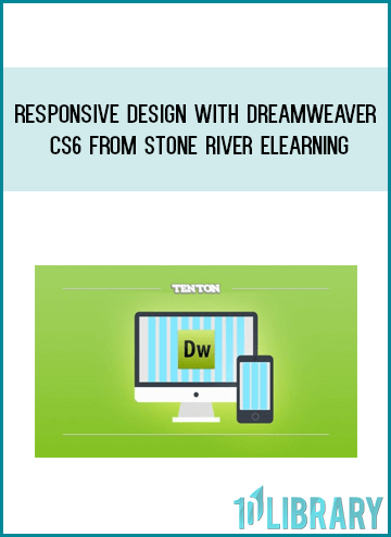
Responsive Design with Dreamweaver CS6 from Stone River eLearning
Learn how to build a website from scratch that’s responsive and flexible by using the fluid grid layout features inside Dreamweaver CS6! This 4+ hour hands-on course, hosted by award-winning software trainer and designer Geoff Blake, will take you step by step through the creation of three different layouts in one HTML document for each type of device used to view the website: mobile, tablet and desktop. First, Geoff will very briefly run you through the basics, getting you comfortable in the Dreamweaver interface. Then, it’s on to building the mobile device network from the ground up by using basic building blocks to insert the logo, header, menu, graphics, text, footer and more! You’ll learn how to adjust the mobile layout to scale, tweaking the design for tablet and desktop devices with the end result being a website that scales depending on whether you’re viewing the mobile, tablet or desktop view.
Your Instructor
Stone River eLearning
Stone River eLearning
Stone River eLearning was started in 2012, and since then we’ve trained over a million students. Our content is timely and up to date with high production value. Above all, our courses are well taught, so you’ll learn more easily than the cut rate courses on some other sites.
Course Curriculum
1.Gettin’ Warmed Up!
Welcome to Responsive Design with Dreamweaver CS6 (1:35)
Previewing the Completed Layout (2:24)
2.Let’s Get Started with Fluid Grid Layouts!
Dreamweaver Set Up (4:13)
Creating A New Fluid Grid Layout (6:14)
Touring Through the Layout (6:19)
Looking At Other Device Views (6:09)
Building the Fluid Grid Layout’s Basic Structure (7:18)
Adjusting Layout Objects (10:42)
Touring And Understanding The External Style Sheet (10:28)
Building The Raw Structure For Mobile (6:18)
Adjusting The Structure For Tablet And Desktop (8:15)
Inserting Nested Divs In The Layout (3:05)
Previewing Your Work (7:30)
Adjusting The External Style Sheet (4:44)
3.Building The Mobile Device Layout!
Building The Header (4:01)
Inserting The Logo (9:49)
Inserting And Formatting The Menu Items (7:25)
Roughing In The Slideshow (2:01)
Building The Positioning Statement Area (8:08)
Getting The New Additions Area Built (9:42)
Constructing The Feature Boxes (14:31)
Finishing Up The Feature Boxes (3:59)
Adjusting The Mobile Layout To Scale, Part 1 (5:31)
Adjusting The Mobile Layout To Scale, Part 2 (6:59)
Formatting The Footer (6:15)
Finishing Up The Mobile Device Layout (6:27)
4.Building Out The Tablet Device Design!
Setting Up A Visual Cue For Device Previewing (6:17)
Adjusting The Tablet Layout’s Logo (5:11)
Configuring Layout Objects To Inherit From The Mobile Style Sheet (3:15)
Adjusting The Positioning Statement And New Additions Areas (3:51)
Setting Up The Tablet Device’s Feature Boxes, Part 1 (5:31)
Setting Up The Tablet Device’s Feature Boxes, Part 2 (7:58)
Let’s Cheat! Here’s How To Fix Scaling Graphic Margin (4:03)
Fixing The Mobile View (5:47)
Finishing Touches For The Tablet Layout (3:41)
5.Building The Desktop Layout!
Adjusting To Accomodate A Fixed-Width Desktop Layout (3:44)
Adjusting The Desktop Layout’s Logo (1:54)
Tweaking The Slideshow Positioning (0:55)
Applying Desktop-Only Formatting To The Menu (3:21)
Fixing The Positioning Statement And Feature Boxes (8:01)
Final Desktop Layout Adjustments (2:51)
6.Finishing Up with Some Final Adjustments!
Cleaning Up The Style Sheet (4:54)
Hiding Layout Content Between Devices (5:15)
7.Wrapping Up Fluid Grid Layouts
Where To Go From Here (0:28)
We guarantee that all our online courses will meet or exceed your expectations. If you are not 100% satisfied with a course – for any reason at all – simply request a full refund.
That’s our promise to you. We hate games, gimmicks and tricks as much as you do. We guarantee no hassles if you want a refund, so ahead and order with confidence. You have absolutely nothing to lose.
“This course was very informative. I completed this course in about 8 hours. I had two spots that I had to go back and forth to try and figure out what went wrong. This helps us to become better programmers as we have to find the error/errors in our code. We may even have to fix other peoples code. I posted my spots I had trouble so hopefully everyone else has smooth sailing. I would recommend this course!”
Get immediately download Responsive Design with Dreamweaver CS6 from Stone River eLearning
Be the first to review “Responsive Design with Dreamweaver CS6 from Stone River eLearning”
You must be logged in to post a review.
The Course is digital products included PDFs,Videos (MP4,TS,AVI files), Audio (MP3,M4A), Document (Word, Exel,Power Point..)
We will provide the download link accordingly with the Email address on your “Order Reciep”.
Skype : [email protected]
Related products

Everything Else
Everything Else

Everything Else
Everything Else
Graham Jamieson – Hypnosis and Conscious States The Cognitive Neuroscience Perspective

Everything Else

Everything Else
Everything Else
Reviews
There are no reviews yet.